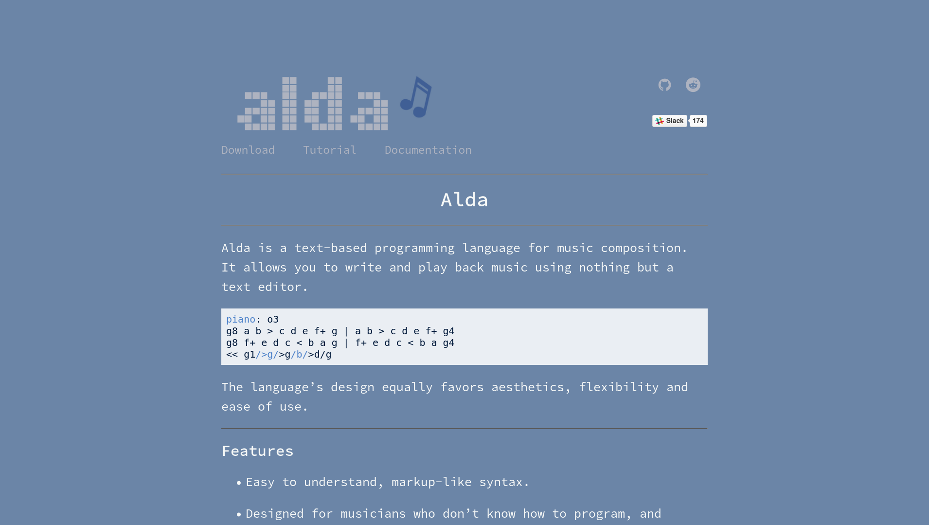
Up until recently, the official Alda website looked like this:

I cobbled together that logo and color scheme sometime in 2017, and I was never particularly excited about it. I kept telling myself that I would come back someday and give the logo and the website a good redesign.
Among the things I didn’t like about it:
-
The dull blue and gray color palette is rather depressing, like a rainy day.
-
The logo is boring. It’s just the word “Alda” in some mildly interesting pixelly font I found, with a slightly rotated set of sixteenth notes off to the side. Yawn.
-
The logo already says “Alda,” so what’s the point of also having a heading that says “Alda”?
-
The Reddit, GitHub and Slack links at the upper right look a little arbitrary and out of place. And it’s hard to even tell at first glance what they are.
-
While I think using monospace fonts everywhere is kind of a neat aesthetic, I don’t think it totally “works” on the Alda website. It’s nice to have some monospace elements in places where it’s tasteful and appropriate (like code blocks), but using a monospace font as the primary font for the content of the website ended up looking a little, well, monotonous.
(As an aside, I realize that I’m still doing the same thing here on my blog. I’m not sure why, but it doesn’t feel like it’s a problem when I do it here. I think the difference might just be that a casual programming blog has a different vibe than a “landing page” style website for an open source software project.)
These thoughts eventually pestered me to the point that I couldn’t help but go down the rabbit hole and create a new logo and a new website design to accompany it. Read on to see how it turned out!
Color palette
The first step was to come up with a set of colors to use in both the logo and the website. There are a bunch of useful tools out there to help you generate a color palette, but in this case, I just sort of stumbled upon a shade of light blue that I liked, held it up next to a really simple set of black, beige, light gray and dark gray colors, and it ended up looking good, so I went with it.
Here are the colors:
| #35c0ed | #000000 | #f5f5f5 | #e3e3e3 | #909090 |
Logo
For my first attempts to create a new logo, I tried to use a handful of the free “logo maker” tools that you find out there if you do a quick web search. I found them all to be about the same. You type in the name of your product/company/whatever, make some selections from a bunch of sample logos that look similar to the style you’re going for, and maybe pick a stock icon to put next to the text, and you end up with a reasonably professional-looking logo.
After doing this a few times, I found that I just wasn’t happy with the results. I really wanted the new Alda logo to have a unique graphical element, and there was no way that I was going to get that from one of these logo making tools.
I’ve never been a great visual artist, so up until this point, I was putting off the idea of creating a logo myself from scratch. But after seeing the underwhelming results of the logo maker tools, I could start to see the appeal of making something fresh and new for the Alda logo. I just needed to figure out how to do that.
I had a few image concepts in mind:
- An old CRT monitor displaying a music note
- A music note composed of bits or pixels
- A command line prompt followed by a music note, e.g.:
>♪ - A music note between two repeat signs
I’d noticed that a bunch of professional software projects have logos that are SVGs, so I set about trying to learn how to make an SVG logo. After a brief period of insanity in which I considered writing a program that outputs an SVG, I started looking at GUI software designed for creating and manipulating SVGs. I quickly found Inkscape and fell in love.
Inkscape is the program for people who want to make nice looking logos and other graphics. If you’re not familiar, it’s kind of like Photoshop, but easier to use, and optimized for combining simple geometric shapes to make more complex ones. You can draw something freehand, then convert it into a “path” object and drag the nodes around to get it to be just the way you want it. You can create polygons, rotate them, skew them, scale them, clone them a bajillion times and arrange them in a line, and click a button to align them exactly along their edges. You can select two interesting shapes and combine them in various ways to make an even more interesting shape. And best of all, just about anything you can do with the mouse, you can do much faster with keyboard shortcuts.
The tutorials that come with Inkscape are also fantastic. Within a few days, I was able to figure out how to take an existing SVG of a music note that I found, recreate it using a bunch of light blue squares and triangles spaced out evenly, and place it against the backdrop of a gray set of repeat signs. Before I knew it, Alda had a new logo:
Website
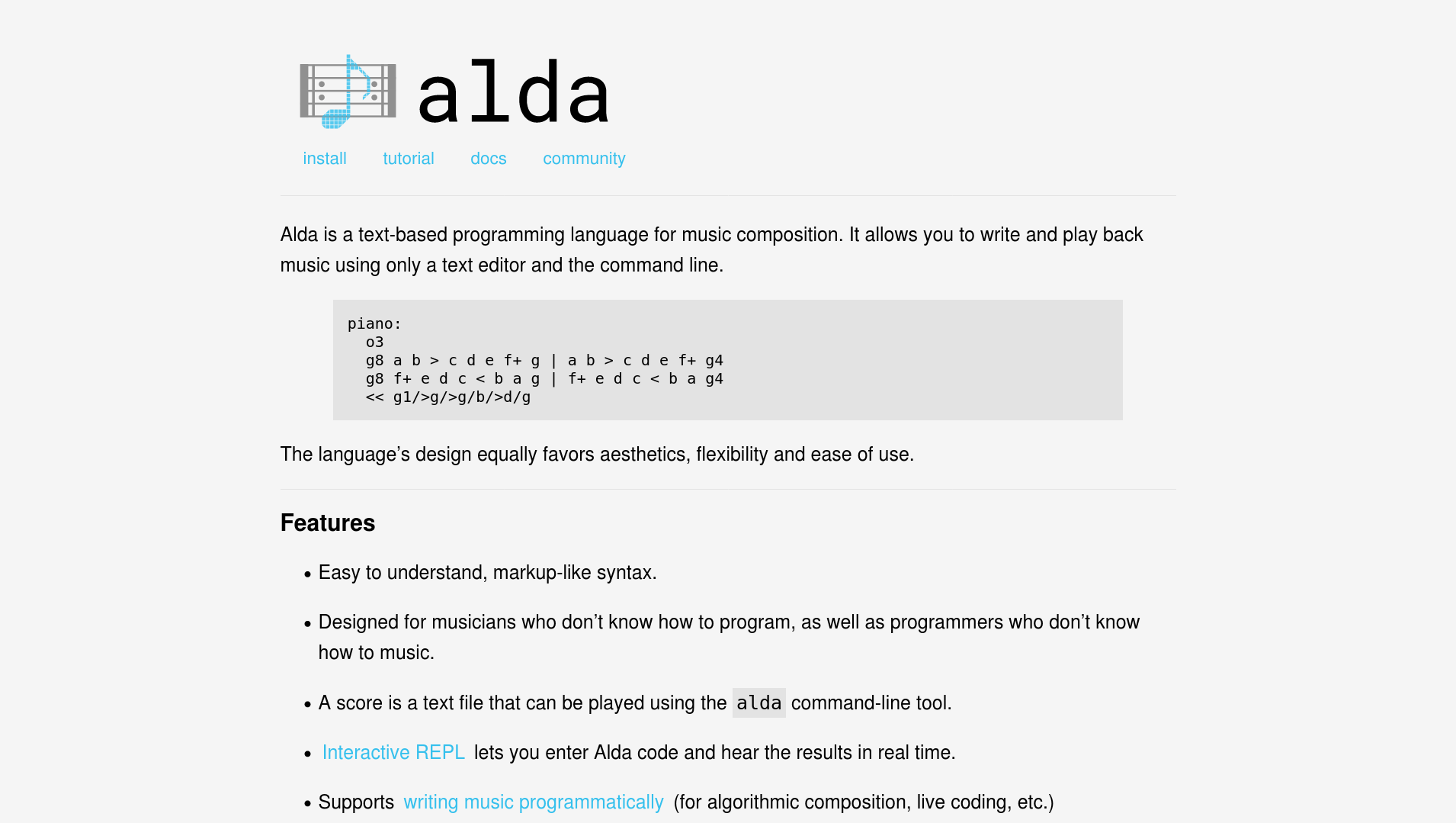
At this point, I had a nice new logo and color palette in hand, so updating the Alda website was a breeze. The old website layout was already pretty decent, it was mostly just in need of a fresh coat of paint. I replaced the old logo with the new one, and I swapped out the old, depressing colors with the new, invigorating ones. While I was at it, I found a handful of small things that I was able to reword or organize better. And I did something about all of that monospace monotony.
I did end up incorporating a monospace font into the new Alda logo, and there are code blocks where the font is monospace, but apart from that, I found that it looked quite nice to use a “normal,” sans serif font for the primary content of the website.
Here’s the end result:

I hope you like it!
Comments?
Reply to this tweet with any comments, questions, etc.!